Finbite
Finbite is the Baltics' leading all-in-one invoicing platform — covering e-invoicing, digitization, expense reports, and approval flows for businesses of every size.
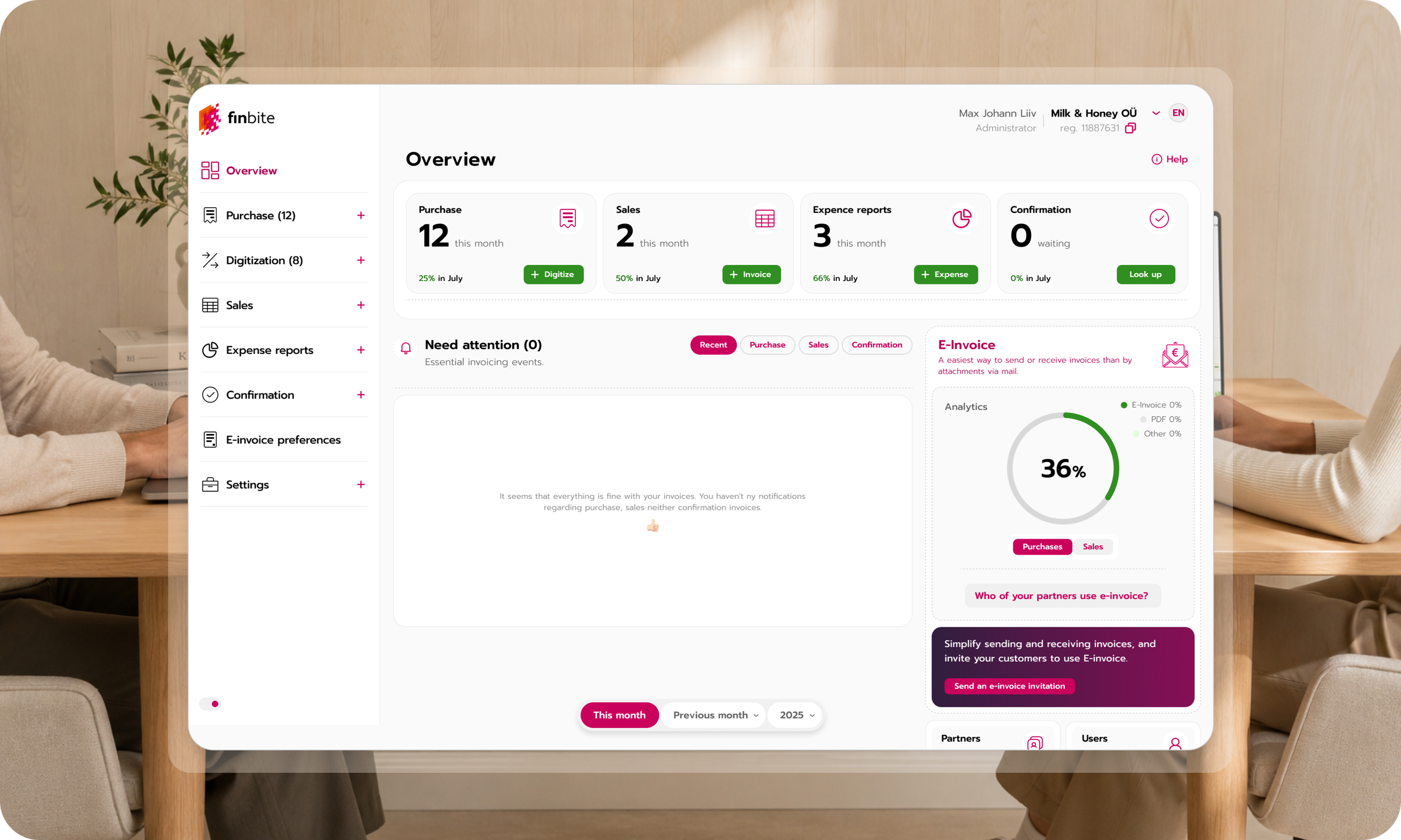
project
Finbite was a 15+ year-old invoicing platform with years of complexity built into it. I joined in 2023 to help make it significantly simpler — without breaking the workflows businesses already depended on.
What began as a major product redesign became a deeper exploration of the system itself: understanding legacy decisions, questioning complexity, redesigning more than 80 views and workflows, and helping shape where the product should go next.
I continued evolving Finbite’s product experience and direction until 2026.
-
I led the Finbite redesign end to end — from understanding complex legacy workflows and rethinking the product experience to interaction design and a new design system.
The goal wasn’t simply to modernize how Finbite looked, but to make a mature, complex product clearer, more consistent, and significantly easier to use across devices.
-
Team
Finbite’s internal engineering team + an external development partner.
Scope
Rethinking a complex, 15-year-old enterprise invoicing platform while preserving the critical workflows its customers depended on — from businesses to government institutions, telecoms, and banks.
-
Over 15 years, Finbite had evolved into a patchwork of workflows, patterns, and client-specific solutions — while becoming critical infrastructure for some of the region’s largest organizations, including government institutions, telecoms, and banks.
Starting over wasn’t an option. The real challenge was finding how much clarity and consistency could be created inside a system that had accumulated years of technical and product constraints.
Constraints as the Real Brief
1. The brand
A previously approved visual identity — bold in color and closer to the fund industry than enterprise software — had to stay. The challenge wasn’t to replace it, but to translate it into an interface that could support a dense, complex product.
2. The codebase
Finbite ran on a legacy, partially custom codebase that was no longer fully supported. Changes that looked trivial in Figma could become significant engineering problems.
Elements that appeared identical in the interface often existed as separate implementations, built with different libraries in different parts of the system. Fixing one field could mean solving the same problem several times.
This made design decisions inseparable from technical reality.
3. The reframe
A clean-sheet redesign would have been easier. It also wasn’t the problem.
The real task was to find the highest-leverage changes within the constraints: reduce inconsistency, simplify what could be simplified, establish reusable patterns, and make each intervention improve the system rather than add another layer to it.
The goal wasn’t a perfect redesign. It was meaningful progress in a system that couldn’t stop while we changed it.
-
1 — Rethinking the Primary Navigation
Finbite’s top navigation had accumulated too many sections and nested menus. On smaller screens, it eventually ran out of horizontal space and visibly broke.
The decision
Move the primary navigation from the top of the interface to a vertical panel on the left.
For a product this dense, vertical space was simply more resilient. A left-side navigation could accommodate more sections, group and collapse content, and scale across screen sizes without pushing essential functionality into overflow menus.
The goal wasn’t just a different layout. It was to create a navigation model that could handle both the product Finbite had become and whatever it needed to become next.
The trade-off
In a modern codebase, this might have been a relatively straightforward change. In Finbite, the top navigation was embedded across almost every part of the platform.
Replacing it meant touching one of the most interconnected pieces of the system — making a visually simple decision one of the most technically demanding changes in the entire redesign.
We made it anyway, because fixing the foundation created more value than continuing to design around its limitations.
2 — Unifying the System
Before designing a new system, I needed to understand the one that already existed.
Over several months, I catalogued inconsistencies across the platform — screen by screen, workflow by workflow, field by field — looking for patterns hidden beneath years of one-off implementations.
The objective wasn’t simply to make similar elements look the same. It was to identify where one reusable decision could replace many individual ones.
-
The pattern library
The audit became the foundation for one shared visual and functional language across Finbite — replacing years of one-off fields, buttons, forms, and interaction patterns with a consistent system.
Where the legacy architecture allowed, I went beyond visual consistency: rethinking field order, simplifying interaction logic, removing unnecessary variation, and making common actions behave predictably across the product.
The goal wasn’t to make every screen identical. It was to make the product feel like one product.
Extending the system into new flows
Once the foundation was in place, the same principles could shape entirely new experiences rather than simply improve existing ones.
I designed a new registration flow and an OCR-based invoice digitization module that reduced manual data entry and brought the new interaction patterns into some of the product’s most important workflows.
These became early examples of what Finbite could feel like when the experience was designed as a coherent system from the start.
Results
Finbite moved from years of fragmented, client-specific solutions to one coherent product experience — without disrupting the workflows existing customers depended on.
A unified design system replaced one-off patterns across government, telecom, and banking clients. Navigation became resilient across screen sizes, forms followed a consistent standard, and new registration and digitization flows brought that same clarity to the very first interaction with the product.
Instead of designing around accumulated complexity, Finbite now had a foundation for reducing it.
Design principle